Media Queries For HTML Elements
Problem
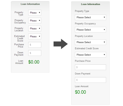
Recently, I needed to reuse some markup for a component. The markup to be reused was to be put inside a modular, HTML component in a side panel of our application. Alternatively, it was the main content on another page. The problem is that the component needed to respond to the width of the side panel, which only took up 2 columns of an 8 column grid. So, basically I needed that media query to display the “mobile view” inside that 2 column panel. The CSS styles for the mobile view cannot be rendered unless the media queries conditions were met. I used the same markup for the side panel, but without the media queries firing off, the layout was not stacking the way I needed it to (figure 1). My first thought was to have 2 separate HTML snippets, but that’s not practicing modular design, so I started looking for a solution.

figure 1
Solution
While I was looking for a solution, Zurb put out a post on Responsive Ads, which uses an <iframe> to stand in as the viewport. If you use a media query inside an <iframe>, it functions as an element query by using the width of the <iframe> HTML element instead of the viewport. Although this solution might not be ideal, it’s working as expected. Let’s take a look at how I implemented it.
The first thing I did was took the markup for the HTML component and put it in it’s own component.html file. In the <head> of component.htm, I added the css containing media queries needed.
<head>
  <link rel="stylesheet" type="text/css" href="css/main.css">
</head>

<body>
<!-- Component Markup -->
</body>
In the parent.html file, we need to include the <iframe> in the appropriate area where the component should be. We also need to set the <iframe> width to 100% via CSS. Use frameBorder=”0″ and scrolling=”no” on the <iframe> to hide the borders and horizontal / vertical scrollbars. Set the src attribute to pull in component.html.
<head>
  <style type="text/css">
    iframe {
      width: 100%;
    }
  </style>
</head>

<body>
  <div>
    <iframe src="component.html" id="component" frameBorder="0" scrolling="no"></iframe>
  </div>
</body>
Implementing the above code will display the component, but now the height of the <iframe> is not matching the height of the content inside component.html. This is because if you don’t specify the width and height, it defaults to 300×150. We’re going to have to use a little JavaScript to make this happen. First, let’s make a slight change to component.html.
<head>
  <link rel="stylesheet" type="text/css" href="css/main.css">
</head>

<body onload='parent.resizeIframe(document.body.scrollHeight)'>
<!-- Component Markup -->
</body>
As you can see, I’ve added an onload attribute to the <body>. This JavaScript snippet will get the height of the specified elements content. In this case, it’s the <body>, which contains the entire components markup. The reason we have to do this is because you may never know the height of the content and it may change if you’re displaying different views inside the component area.
Now, we’re going to add a little bit more JavaScript to parent.html in order to apply the contents height to the <iframe>. The downside of doing this is that you’ll first see the default height of the <iframe>, then watch it snap to the new height as the page is loading.
<head>
  <style type="text/css">
    iframe {
      width: 100%;
    }
  </style>
</head>

<body>
  <div>
    <iframe src="component.html" id="component" frameBorder="0" scrolling="no"></iframe>
  </div>

  <script>
    function resizeIframe(newHeight) {
      $("#component").css("height", newHeight) == parseInt(newHeight,10) + 10 + 'px';
    }
  </script>
</body>
Here, we’re passing the height of the content via the resizeIframe function and applying it to the height of the <iframe>. This will not work if parent.html and component.html are on different domains. Like I said before, this might not be the ideal way of doing this. Using JavaScript and an <iframe> is not the way I wanted to go, but for the time being, this is going to have to do.
What’s your workaround for Element Queries?
More on Element Queries
Working around a lack of element queries
