Web Form Design – Label Lengths
Monday, October 31st, 2016
When it comes to web form labels, how long is too long? As a general rule, a designers goal for web forms is to increase intuitiveness, streamline the completion process, increase conversion and optimize for mobile devices. With that being said, I recommend using short, succinct and descriptive labels; one to two words. Not only is this best practice for visual scan-ability, but it also decreases the time it takes a user to complete the form process, which will increases conversion.
Some may use form labels that are first person narrative or Mad Lib style in an effort to try to make web forms “fun” or more “user friendly”. I call this Helicopter Parent UI. Here are some of my concerns with long form labels.
Posted in Accessibility, Web Design | No Comments »
Media Queries For HTML Elements
Thursday, July 17th, 2014
Problem
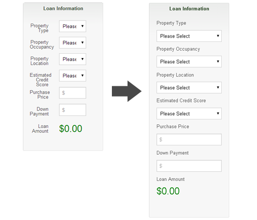
Recently, I needed to reuse some markup for a component. The markup to be reused was to be put inside a modular, HTML component in a side panel of our application. Alternatively, it was the main content on another page. The problem is that the component needed to respond to the width of the side panel, which only took up 2 columns of an 8 column grid. So, basically I needed that media query to display the “mobile view” inside that 2 column panel. The CSS styles for the mobile view cannot be rendered unless the media queries conditions were met. I used the same markup for the side panel, but without the media queries firing off, the layout was not stacking the way I needed it to (figure 1). My first thought was to have 2 separate HTML snippets, but that’s not practicing modular design, so I started looking for a solution.

figure 1
Posted in Code, Design, Development, Mobile, Web Design | No Comments »
